Notifire
MVP for a mobile app to help Californians stay safe from wildfires by providing personalized guidance, information, and tools all in one place
ROLE
UX/UI Design, UX Research, Brand Design
Project Overview
Problem
Californians want to keep their families safe from wildfires, but they face many obstacles.
They find it confusing, stressful, and time-consuming to dig through many competing sources of information and figure out what information is the most accurate, up-to-date, and personally relevant.
As wildfires become increasingly severe and widespread across the state, this problem is only growing.
How might we make it easier and less stressful for users to get the information and guidance they need to protect themselves?
Solution
A mobile app that helps users prepare and respond to wildfires through:
Personalized, real-time alerts with actionable guidance
Information and guidance that is vetted and consolidated at every step
“Evacuation Mode” for quick access to emergency information and resources, designed for use under high stress
A comprehensive map that shows:
Fire progression
Personal saved locations and evacuation zones
Local resources
Process

Discovery
User Interviews
Subject Matter Expert Interviews
Affinity Map
Personas
Two rounds of user interviews to narrow a broad topic down to Californians threatened by wildfires
ROUND 1
What do people need to stay safe from natural disasters?
4 Participants
45min
Based mostly in the US, all living in areas at risk of different natural disasters
Anchored in stories and past experiences, conversations focused on:
If and how they prepare
How they find the information they need
How they stay informed of active disasters
Their own experiences living through disasters
Current challenges
Round one revealed users need different things for different natural disasters. I decided to focus on Californians living with wildfires after speaking to a few and beginning to see significant shared challenges.
ROUND 2
Focusing on California residents threatened by wildfires
4 Participants
45min
Based in California in mostly moderate/high fire risk areas
Anchored in stories and past experiences, conversations focused on:
The type of information they need and how they find it
Specific resources that are the most helpful
How they hear about and monitor fires
Obstacles they face when trying to prepare themselves and their homes
Obstacles they face when responding to active fires
An affinity map allowed me to choose my focus, and recognize patterns for possible
personas and more specific problems to tackle
User Interview Insights
There are too many sources to dig through that leave users asking “what does this mean for me?”
Interpreting personal risk adds time and effort, and causes more stress
Different sources for different information means users have to remember which source is good for what
Preparation and learned behavior specific to dealing with wildfires
For example, users have to keep monitoring active fires because they’re very fast and unpredictable, and greatly affected by changing wind patterns
Where and how users get information
Users mentioned 9 different websites they get information from, none being an all-inclusive source
Alerts are critical — All users want the comfort of knowing they’ll be told when they’re at risk, but current alerts can be too general or missing actionable advice
Word of mouth and social media play an important role, from how users hear about fires to sharing resources, but cross-checking information is a hurdle
Most use a mobile app to monitor fires, but none have all the information users need
Users depend on checklists and tools for preparing and evacuating, but don’t have an easy way to store them
Obstacles to preparing ahead of time
Building fire-safe habits and preparing their homes can be tedious, expensive and time-consuming
Users need a lot of general, fundamental information about wildfires and how to stay safe, and the learning curve takes time and effort to overcome
Wildfires have become larger and more severe in the last 6-8 years. Even long-term California residents in many areas have a lot to learn as they now deal with wildfire risk for the first time
Obstacles to responding to active fires
Even with experience and preparation, the panic and stress of responding to a fire threat make it hard to access and interpret information, and follow premade plans
Personal risk levels can change quickly and require fast action so users need timely updates focused on their specific locations and needs
From my user research, I created three working personas to begin defining my target user and
the specific problem I wanted to tackle
Subject Matter Expert Interviews
Firefighter with the California State Fire Department (CalFire)
CalFire Emergency Command Center Captain and former firefighter
To better understand:
How are information and updates on active fires produced and shared with the public?
What information is critical for residents to know?
“California Wildfires 101” — Qualities of wildfires, California geography and how it affects wildfires
Response protocols and the constraints faced by responders when trying to keep the public informed
How often response teams can feasibly provide new updates
Project Definition
Problem Statements
Ideation
Storyboarding
Secondary Research and Competitive Analysis
After brainstorming ~20 problem statements with matching “How Might We” statements, I chose three that felt the most concrete and important for my personas
Ideation —
Sketching ~30 ideas with the Crazy 8s method


Storyboarding —
Sketching scenarios and flows for the three strongest ideas, again with the Crazy 8s method


Defining the problem
Californians want to keep their families safe from wildfires, but face a range of obstacles.
Users find it confusing, stressful, and time-consuming to dig through many competing sources of information and figure out what information is the most accurate, up-to-date, and personally relevant.
How might we make it easier and less stressful for users to get the information and guidance they need to protect themselves from wildfires?
Proposed Solution
A mobile app that helps users prepare and respond to wildfires through:
Personalized, real-time alerts with actionable guidance on fires that pose a threat
Information and guidance that is vetted, and consolidated at every step
“Evacuation Mode” for quick access to emergency information and resources, designed for use under high stress
A comprehensive map that shows fire progression, personal saved locations and evacuation zones, and local resources
Target user
California residents, ages 25-50, living in areas with moderate-to-high wildfire risk
Secondary and competitive research to understand existing resources and competing apps
I analyzed existing mobile apps geared towards monitoring wildfires to understand the competition and what users may be used to. I paid the most attention to the app mentioned most in interviews (Watch Duty), and the most reviewed and well-ranked wildfire app in the Apple App Store.
To better understand the full scope of information people had access to, I also reviewed the websites mentioned by interview participants.
Design
User Flow
Wireframes
User Flow
In interviews, I heard that users are more worried about the obstacles to monitoring and responding to active fires than to preparing in advance.
For the purposes of an MVP, I decided to focus on the “response” side and moved forward with the following primary flow:
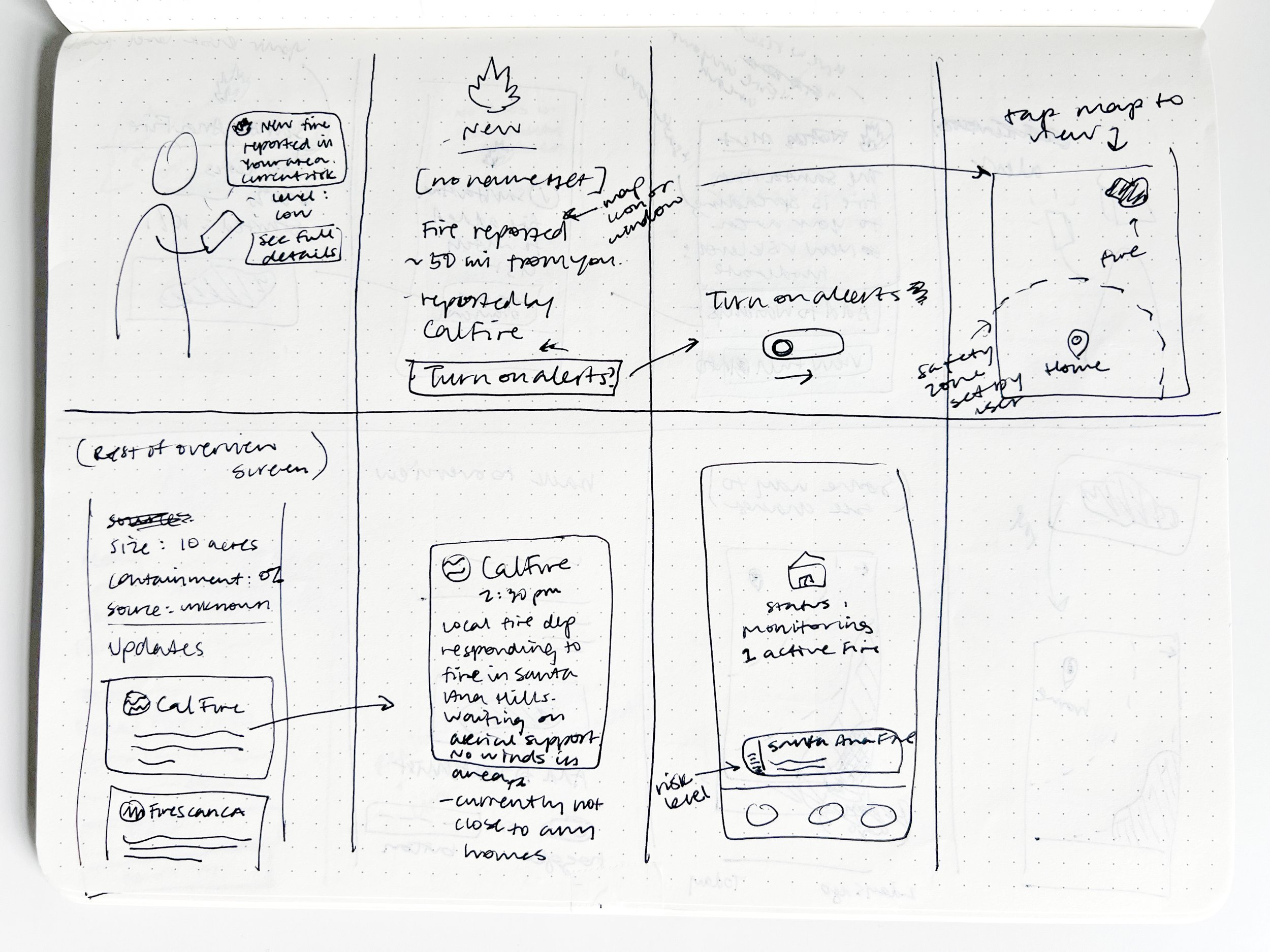
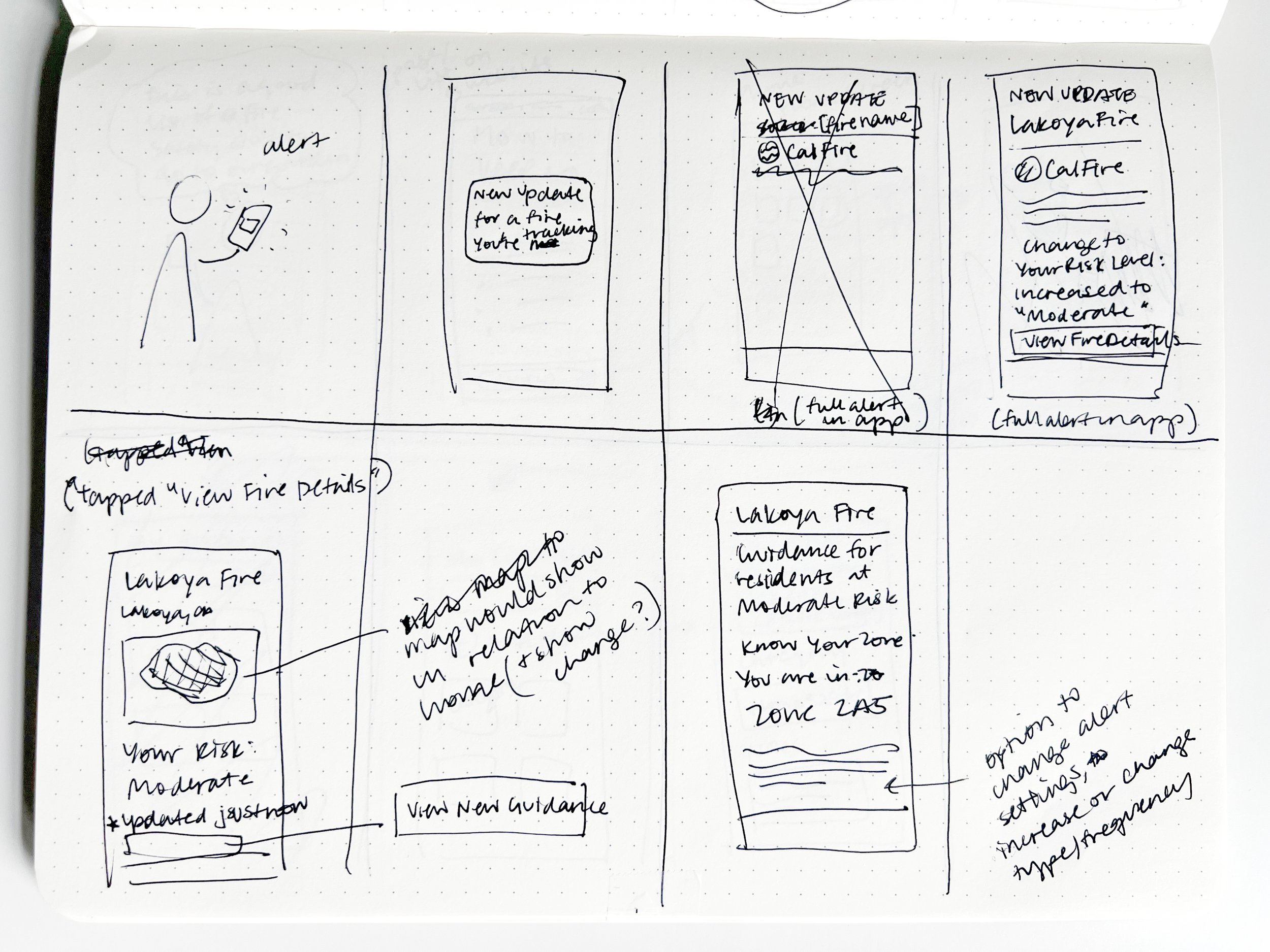
A user gets an alert that their fire risk level has increased, prompting them to decide what to do next
Why start the flow with an alert?
Users said a big pain point they experience is the emergency fatigue caused by having to proactively check and cross-check information sources.
This led me to prioritize personalized alerts that would tell users when there is an important update, rather than design something a user would need to proactively check.
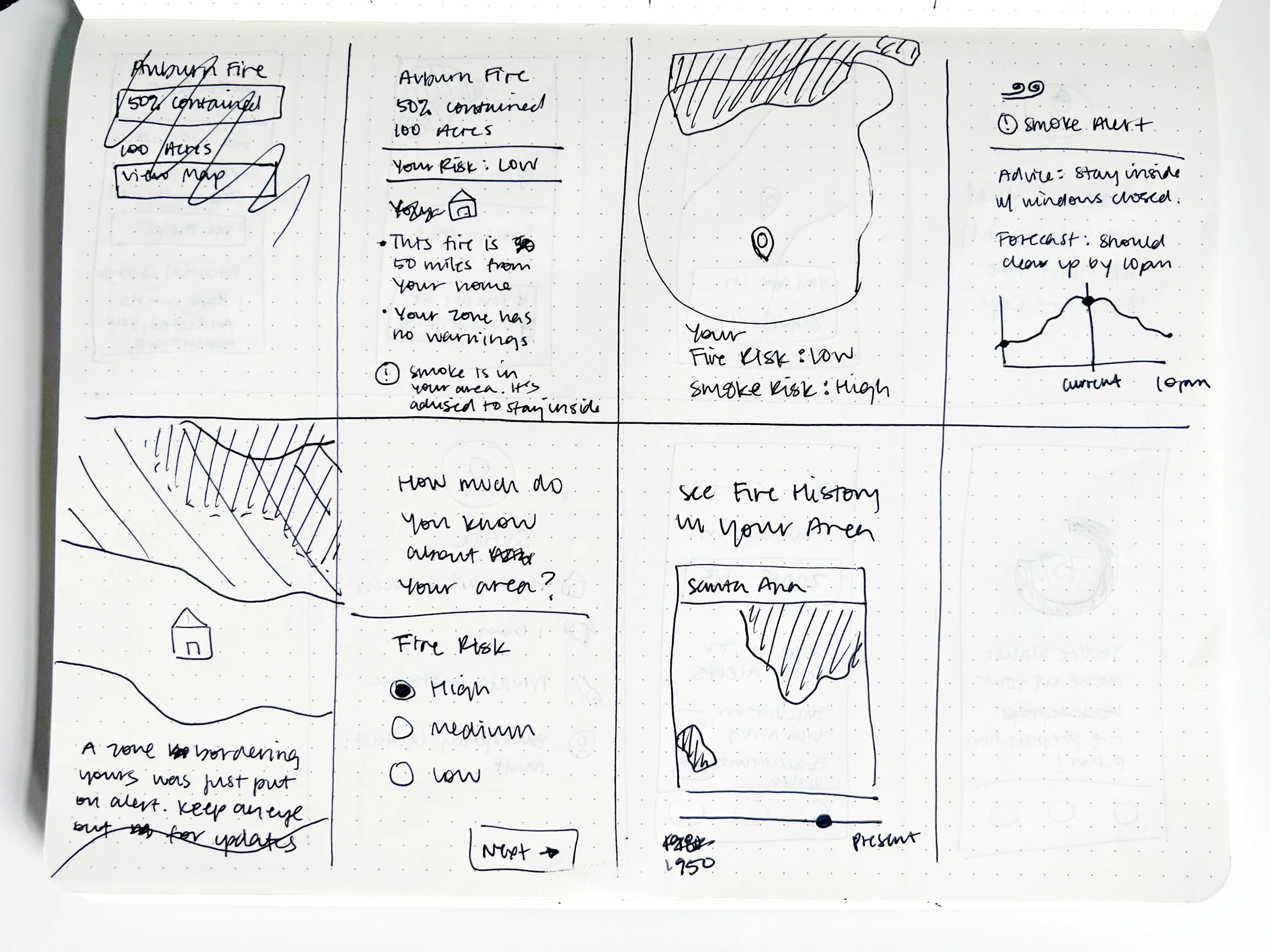
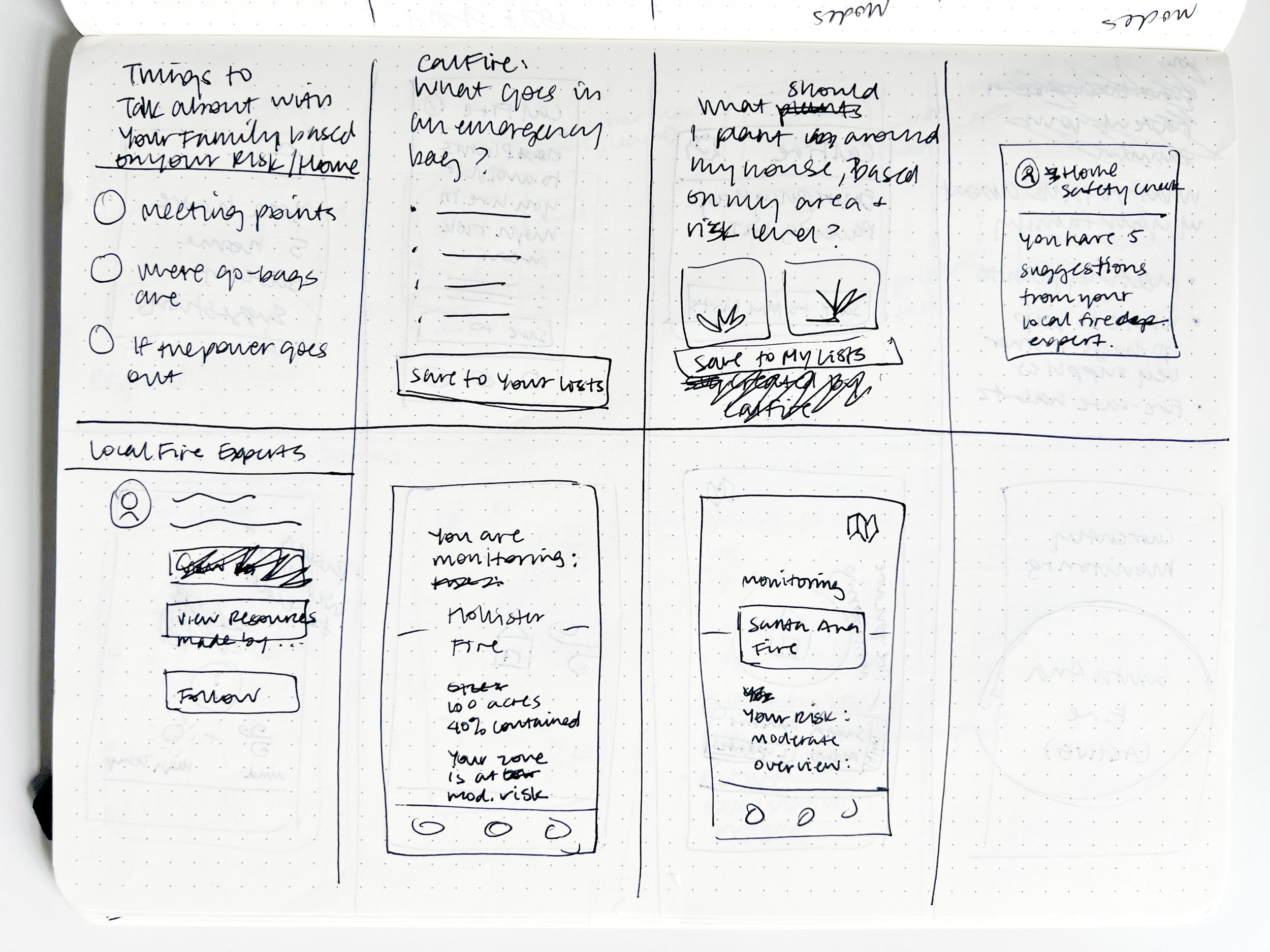
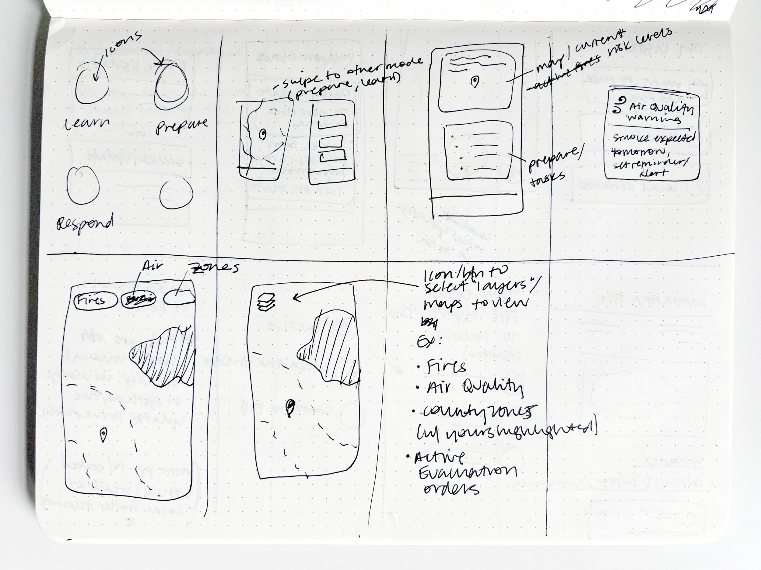
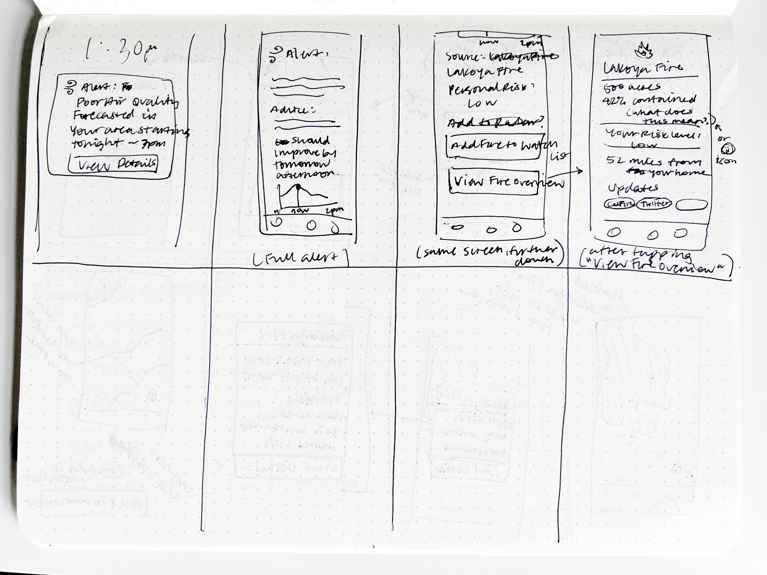
Wireframes
Laying out an experience that:
Centers on the user rather than the fire
Presents information through the lens of “what does this mean for this individual user?”
Avoids information overload—showing information when users need it, in a digestible and skimmable way
Uses accessible, clear language that does not fuel panic
Keeps important user information easily accessible such as a user’s evacuation zone
Caters to the two main user contexts of responding to active fires and preparing in advance


Prototype, Test, Iterate
Low-fidelity Prototype
Moderated Usability Tests
Affinity Map
Low-fidelity Moderated Usability Test
Areas of Interest
How do users interpret the notification, and what steps do they take next?
Do they get all the information they need?
What are their pain points?
After observing what steps they took and asking questions along the way, I had them interact with other main sections of the app
Format
Remote moderated test of Figma prototype
45min
4 Participants ages 25-35 who live or have recently lived in moderate/high-risk fire areas
Revisions were implemented when making high-fidelity mockups
Design
Visual Identity
High-fidelity Mockups
UI Kit
Creating a name and visual identity that embody:
Trust, clarity, and support
I felt it was important to avoid creating a brand that solely conveyed the feeling of crisis.
I instead wanted a visual identity that:
Felt like a calm and collected antidote to panic, while not undermining the severity of the subject matter
Conveyed importance and urgency while not causing more stress
Made users feel supported and helped
Conveyed credibility without feeling cold
Revisions from low-fidelity testing were incorporated as I made high-fidelity mockups
Zones and risk-level terminology —
Matching the real world to avoid confusion
Using existing county and state evacuation zones and risk-level terminology rather than introducing a new type of safety zone and new risk-level names
Users no longer have to reconcile news about their official zones and risk levels with their app-based zone and risk level
New map features to help users better assess risk, and easily find and save important locations
A more informative depiction of a fire’s size and progression paints a clearer picture
All users want to monitor fire risk where loved ones live and they can now search and save those locations on the map
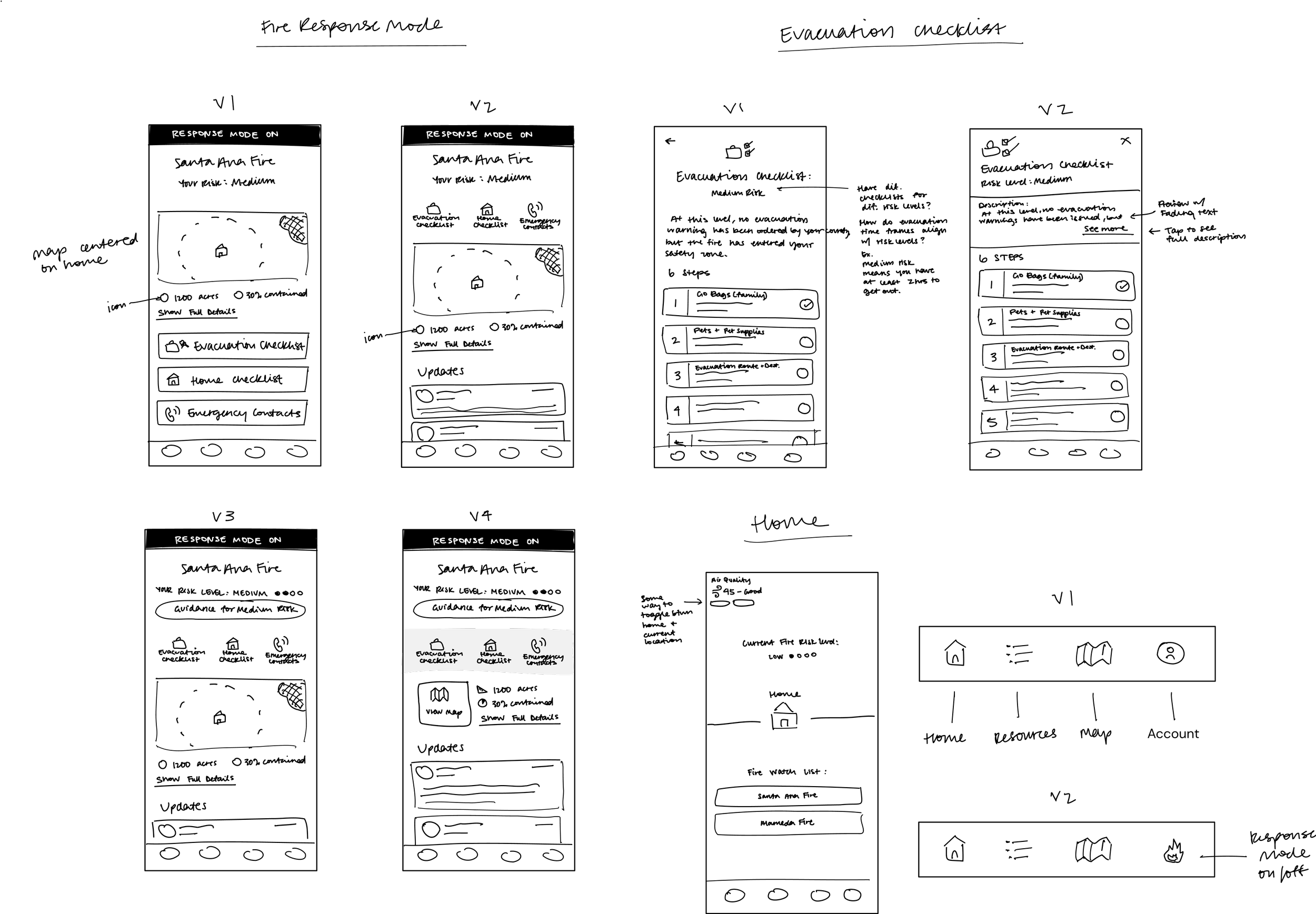
“Fire Mode” — Users like the idea, but it’s not intuitive or easy to understand yet
Changed name to “Evacuation Mode” to make the purpose more clear
Removed from global navigation bar, where users thought it was a section of the app
Making the Home and Alert screens more clear and intuitive
A more intuitive Resources section organized around user context, rather than the type of resource
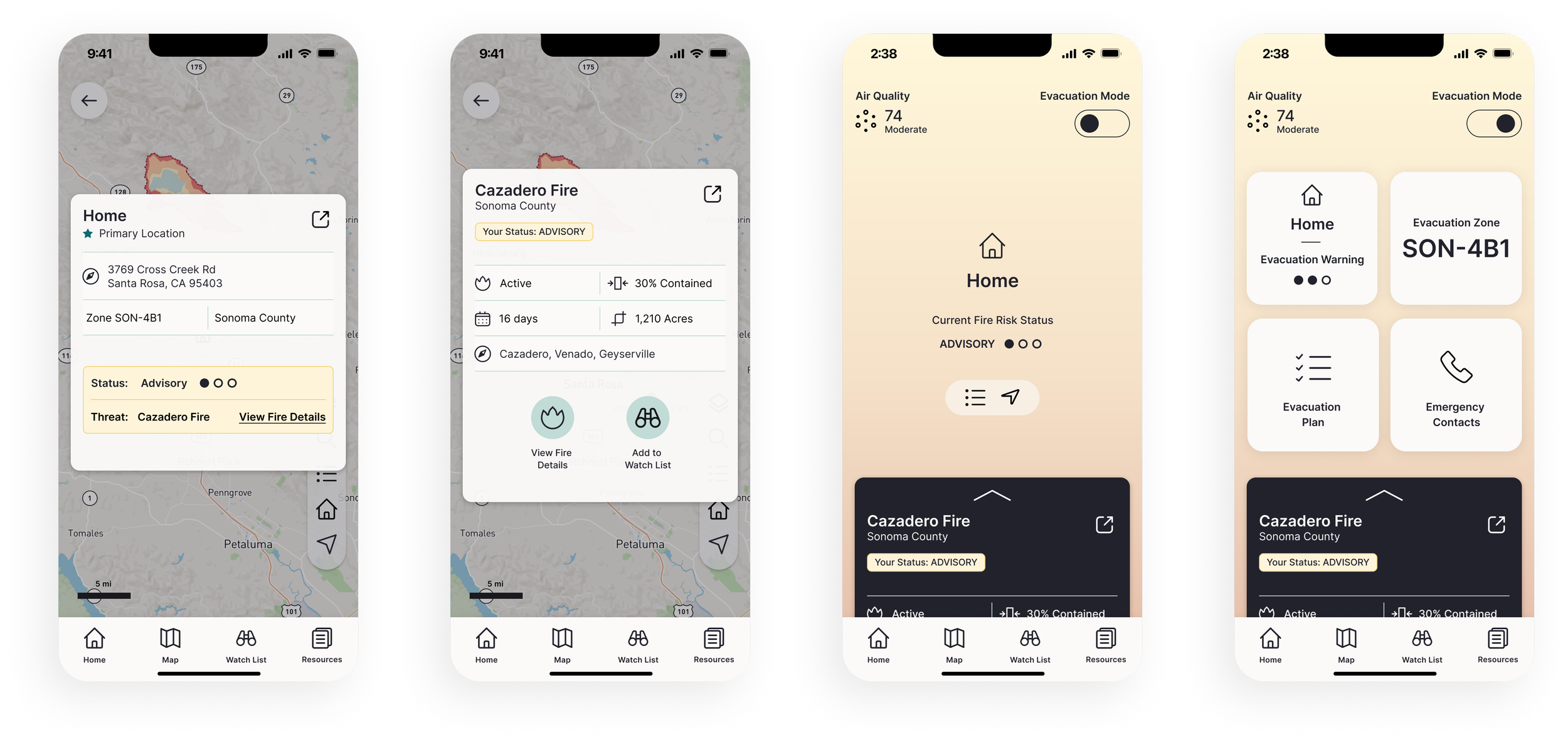
Overview of High-fidelity Mockups


Prototype, Test, Iterate
High-fidelity Prototype
Moderated Usability Tests
Affinity Map
Revisions
High-fidelity Moderated Usability Test
Areas of Interest
How do users interpret the notification, and what steps do they take next?
Do they get all the information they need?
What are their pain points?
After observing what steps they took and asking questions along the way, I had them interact with other main sections of the app
Format
Remote moderated test of Figma prototype
45min
4 Participants ages 27-67 who live or have recently lived in moderate/high-risk fire areas
Revisions
Map — More clarity through labels and new icons, and added local resources
Text labels on locations, user evacuation zones, and fires
Showing county and state evacuation shelters
Clearer icons for “Saved Locations” and showing a user’s home on a map
Home — Removing redundancy, and adding more focus and explanation
Prioritizing a user’s primary saved location (ex. “Home”) and current location
Clearer communication of risk level meaning and guidance
Integrating information on locations and fires affecting them
Background no longer color-coded to match risk level
Evacuation Mode — More obvious and accessible
Prominent control toggle
Screen background color changes to signify activation of Evacuation Mode
Revised tiles and content
Watch List — Now used for both locations and fires to better align with how users think
Cards — More labels, icons, functionality, and cohesiveness
Revised card layouts show more appropriate hierarchy based on how and when users interact with them
Certain functions based on user comments and actions during testing were also added, such as a “What To Do” button on location cards
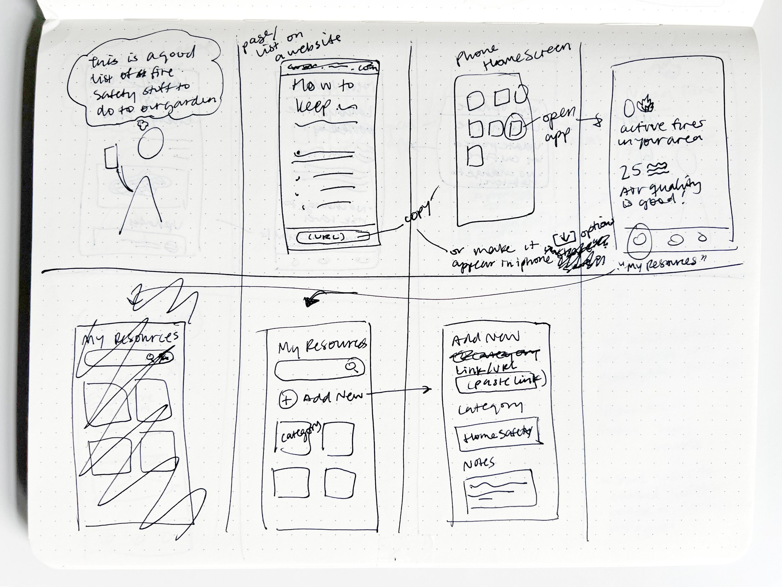
Resources — Reframing content and adding a new way to create and save personal resources
The End Result
Next Steps
More testing — Seeing if my last revisions serve their purpose
Design the “preparation” side of the app and general onboarding experience
Language access — Explore the issue of language accessibility that came to light while talking to firefighters
Reflection
This project was an opportunity to address a complex and growing problem in a place I care about deeply, and to explore my interest in designing for natural disasters.
As obvious as the need for helping people survive wildfires may be, it was incredibly interesting to dive into the complexities of how to address it, from talking to firefighters about tactical response strategies on the ground to the unique and personal obstacles faced by Californians every time they smell smoke in the air.